
Falcons Welcome To Atlanta Campaign
Atlanta Falcons Welcome to ATL
2018 Welcome to Atlanta brand campaign.
Welcome to Atlanta
Where we’re all about that hustle and grind
Where we may get knocked down but we get up swinging
Where Our history doesn’t define us, it drives us
And we stay hungry while others are satisfied
Welcome to Atlanta
Where we separate contenders from contestants
and the strong from the weak.
We’re there’s no room for me,
cause our standard begins with we
Beyond the game. The sweat and pain.
There’s a bond in strength, purpose and pride.
So Welcome to Atlanta.
Where we embrace the hustle and grind.
Logos
Elements
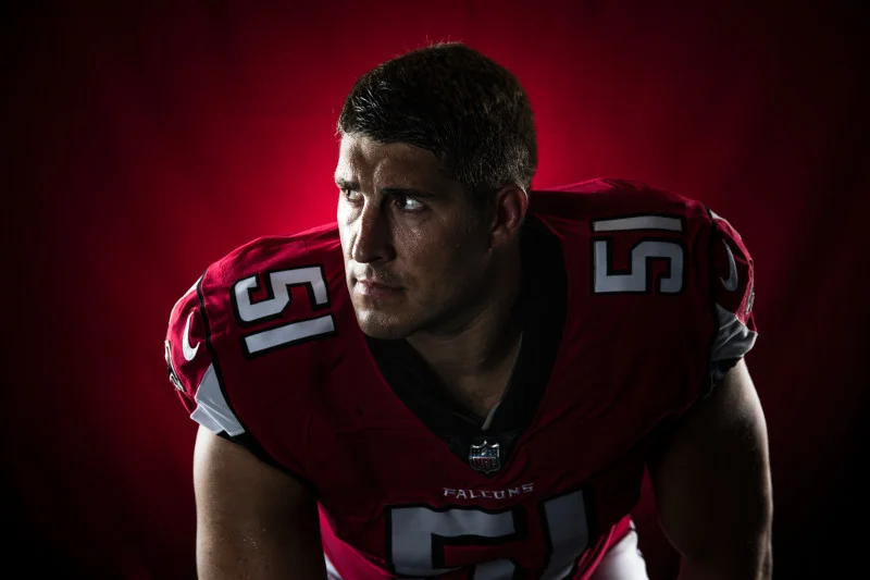
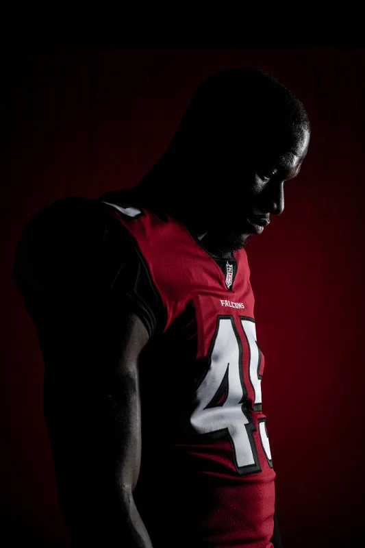
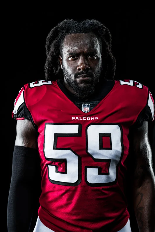
Photography
CITY. FAN. ATHLETE.
Our photography will be strategic in selecting images that help create symbolism between the team the city and our fans embracing hustle and grind and celebrating our victories and successes.
The Grid
WE ARE STRONGER & BETTER TOGETHER.
The grid represents the individual parts that come together represent the stronger whole. Whether it be neighborhoods coming together to form our diverse city, our fans rallying as one thunderous voice or our athletes bonding in battle.
Together we are stronger. Together we are better.
Organic Elements.Textures
THERES NOTHING SOFT ABOUT THIS CITY OR THIS TEAM.We embrace our rough edges and we’re bringing more of the grit and grind of street to everything we do. Distress textures, Tattered edges, Staples, Tape, Accent line
Tear 1
Distress Texture
Distress Texture 2
Halftone Pattern
Tape
Staple
Typography
BIG, BOLD & IN YOUR FACE
We’ve developed a diverse set of typefaces that offer a unique set of combinations that permit us to amplify legibility, hierarchy and tone based on the use case.
Headliner: primary use for headlines
Chairdrobe: primarily used as supporting copy and introducing lighter weights for hierarchy among messaging.
Pure Heart SVG: should be used strategically and sparingly to compliment the Headliner and Chairdrobe fonts to amplify text that needs to be emphasized.